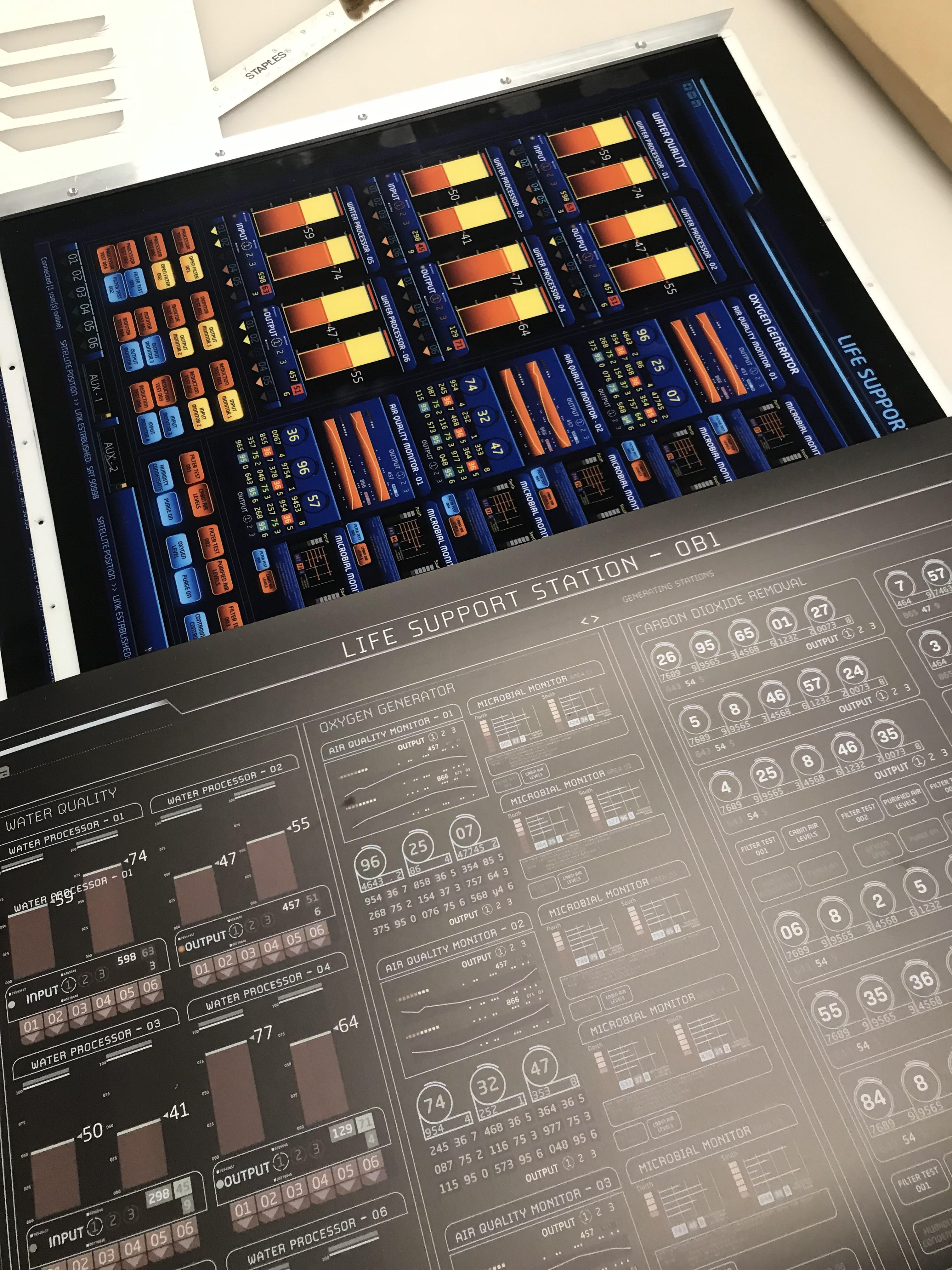
One of the first tasks for this project was to choose a new color scheme that would improve visibility and lessen the heat signature of the graphics when viewed on camera. The final image displays the original season one file, and the side-by-side comparison demonstrates the changes made to the text and colour scheme. Since they needed to resemble actual LCD screens, these graphics were created to be backlit.
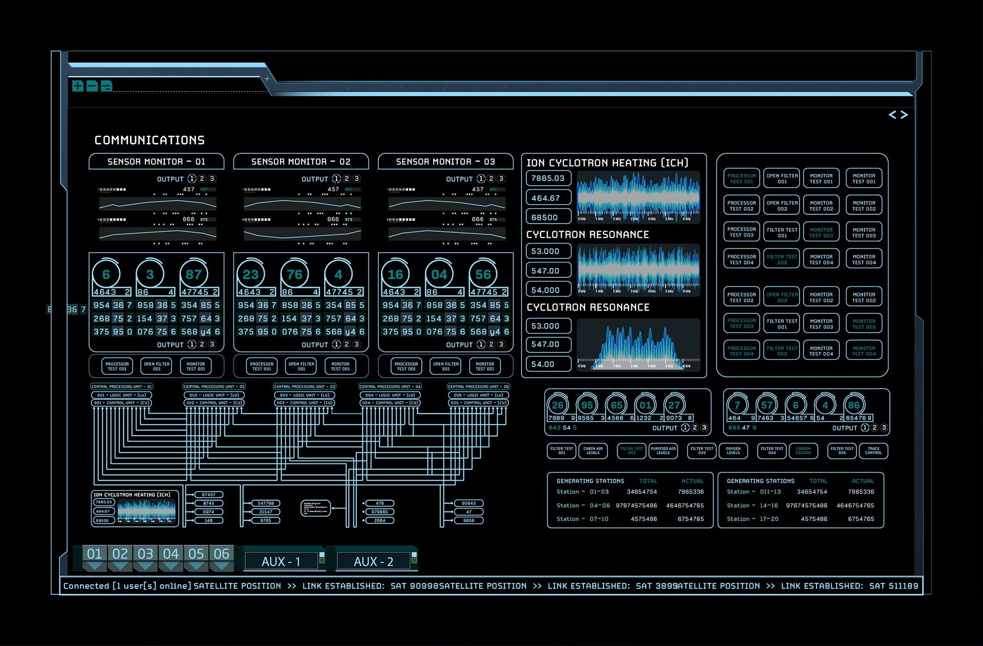
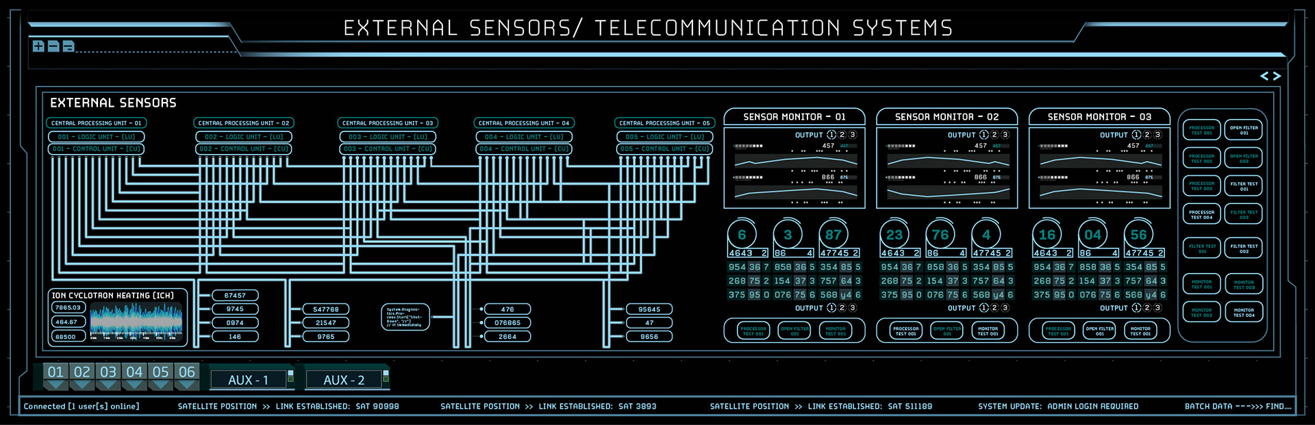
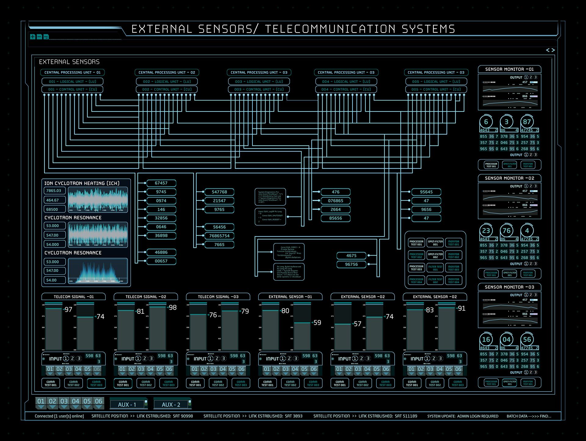
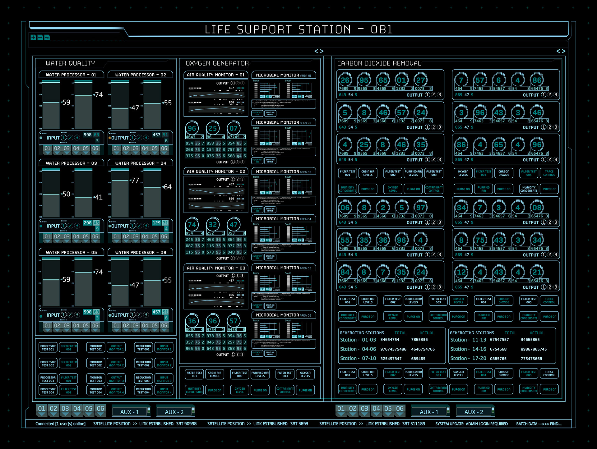
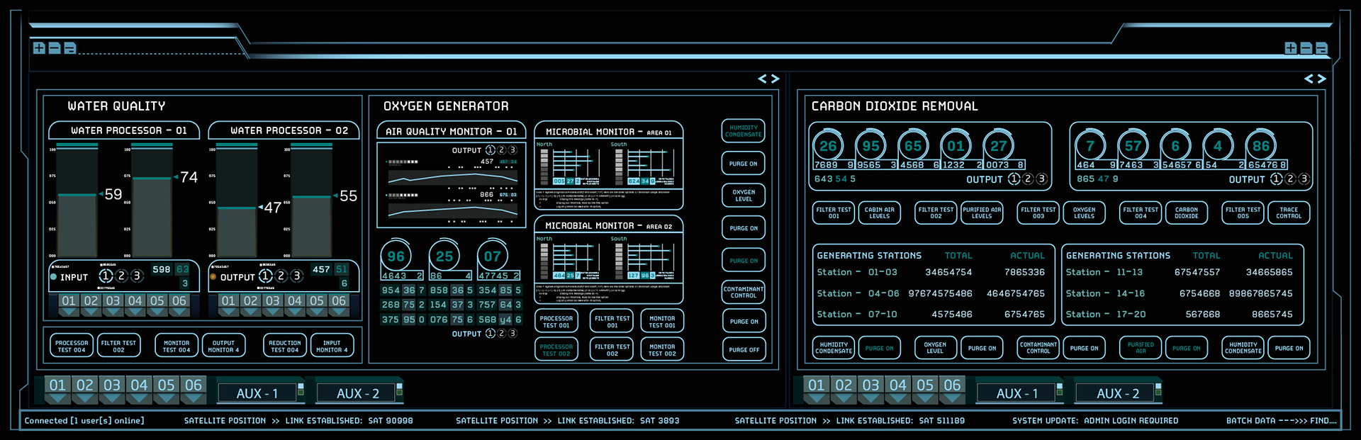
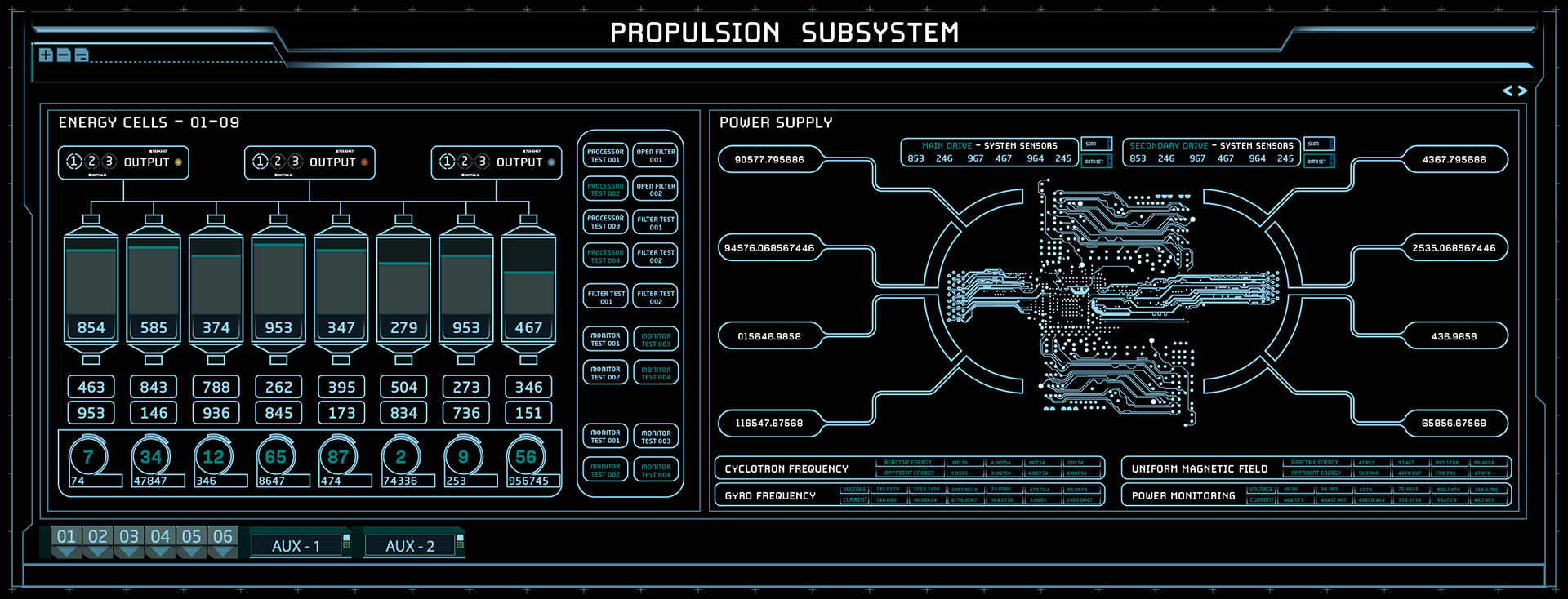
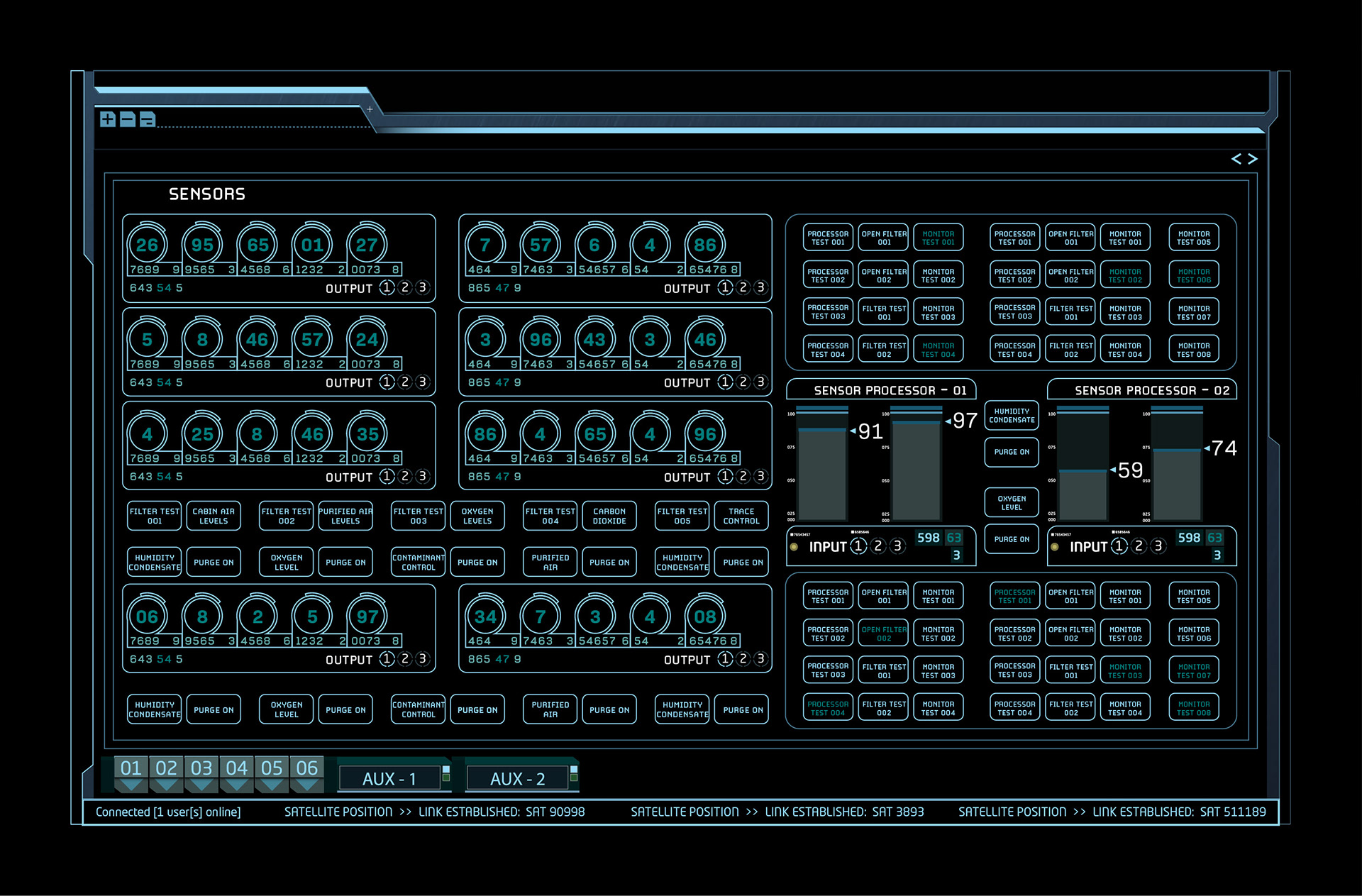
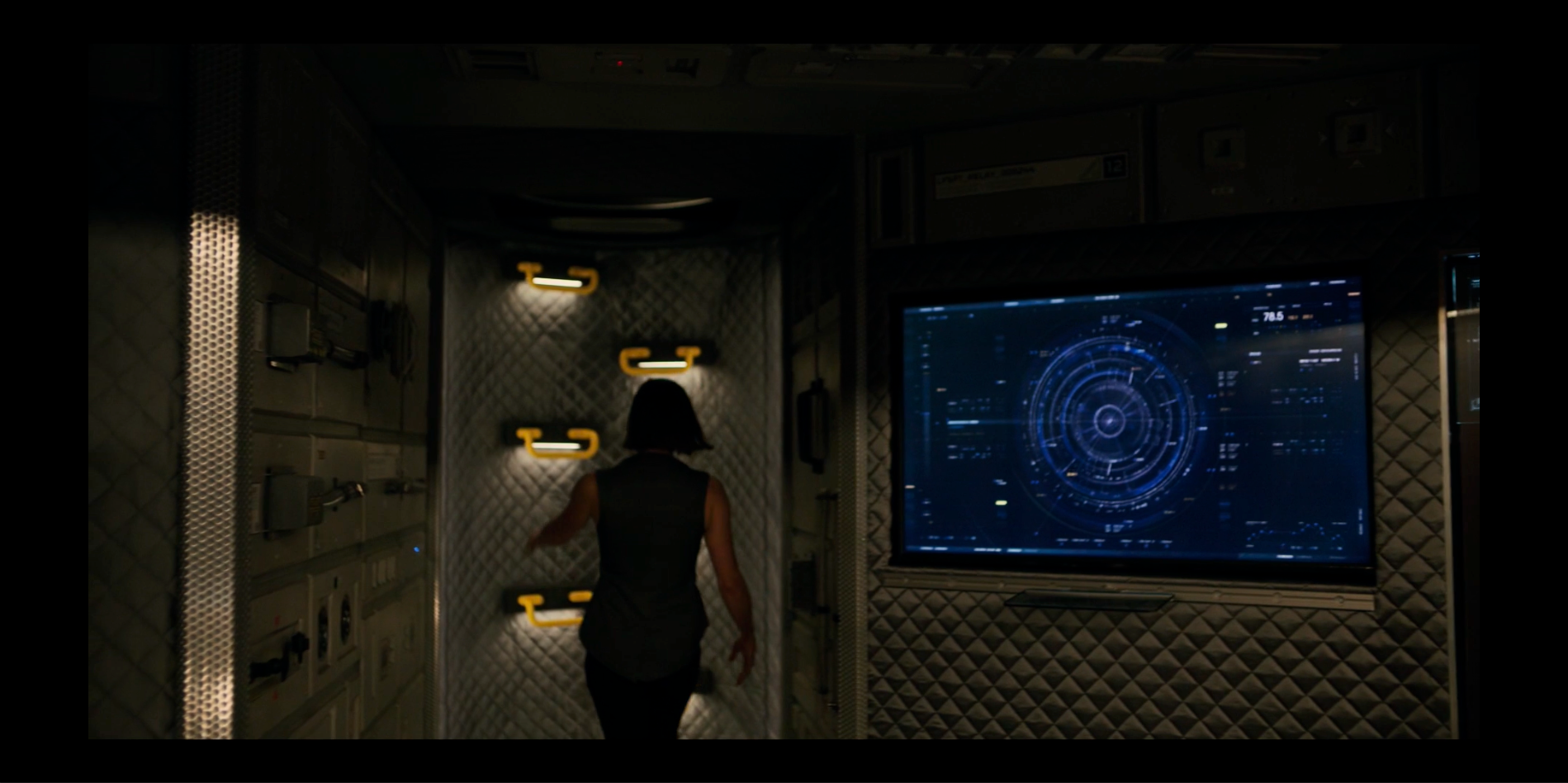
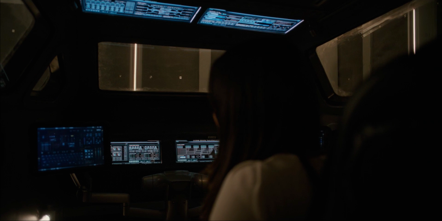

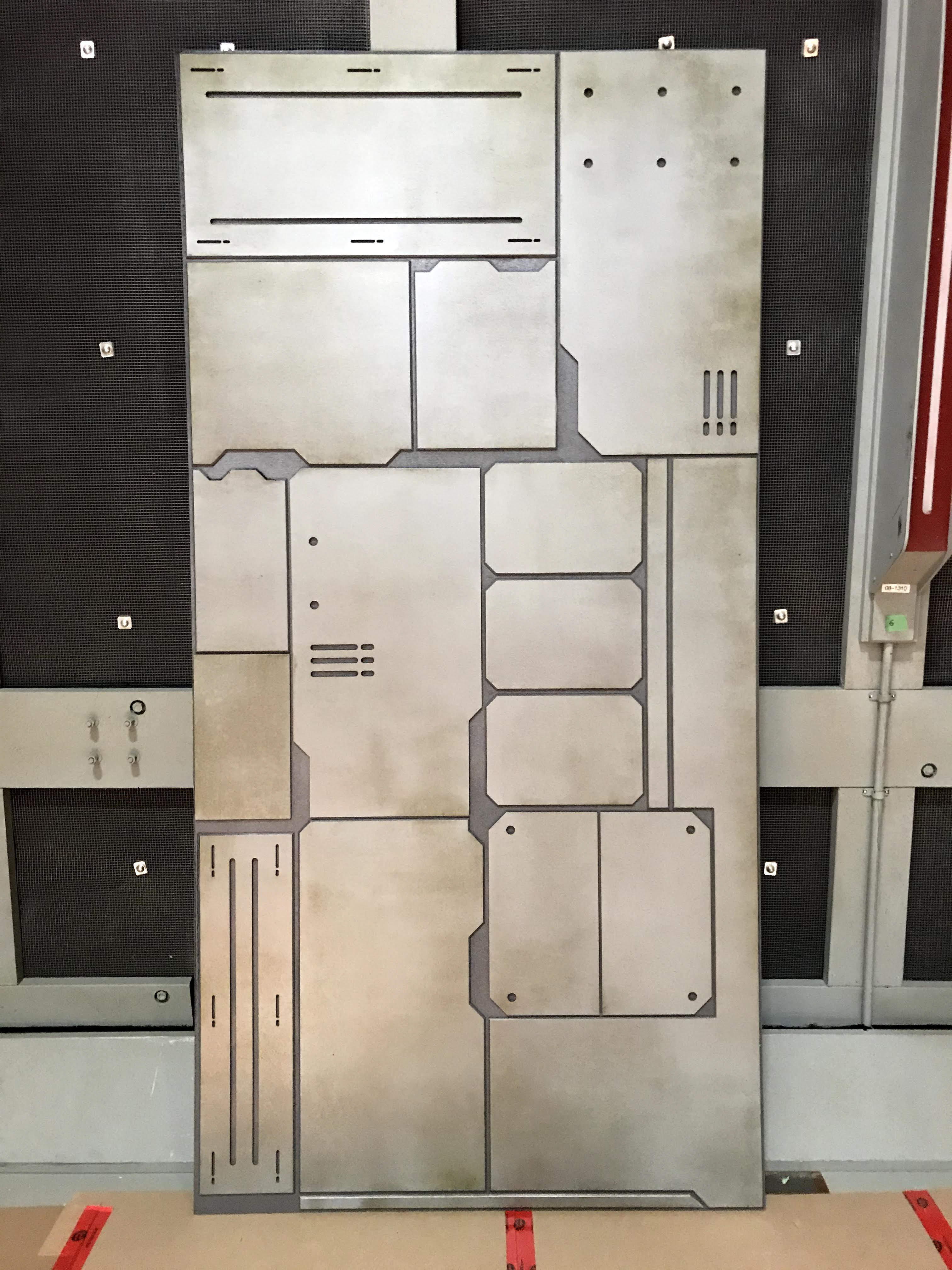
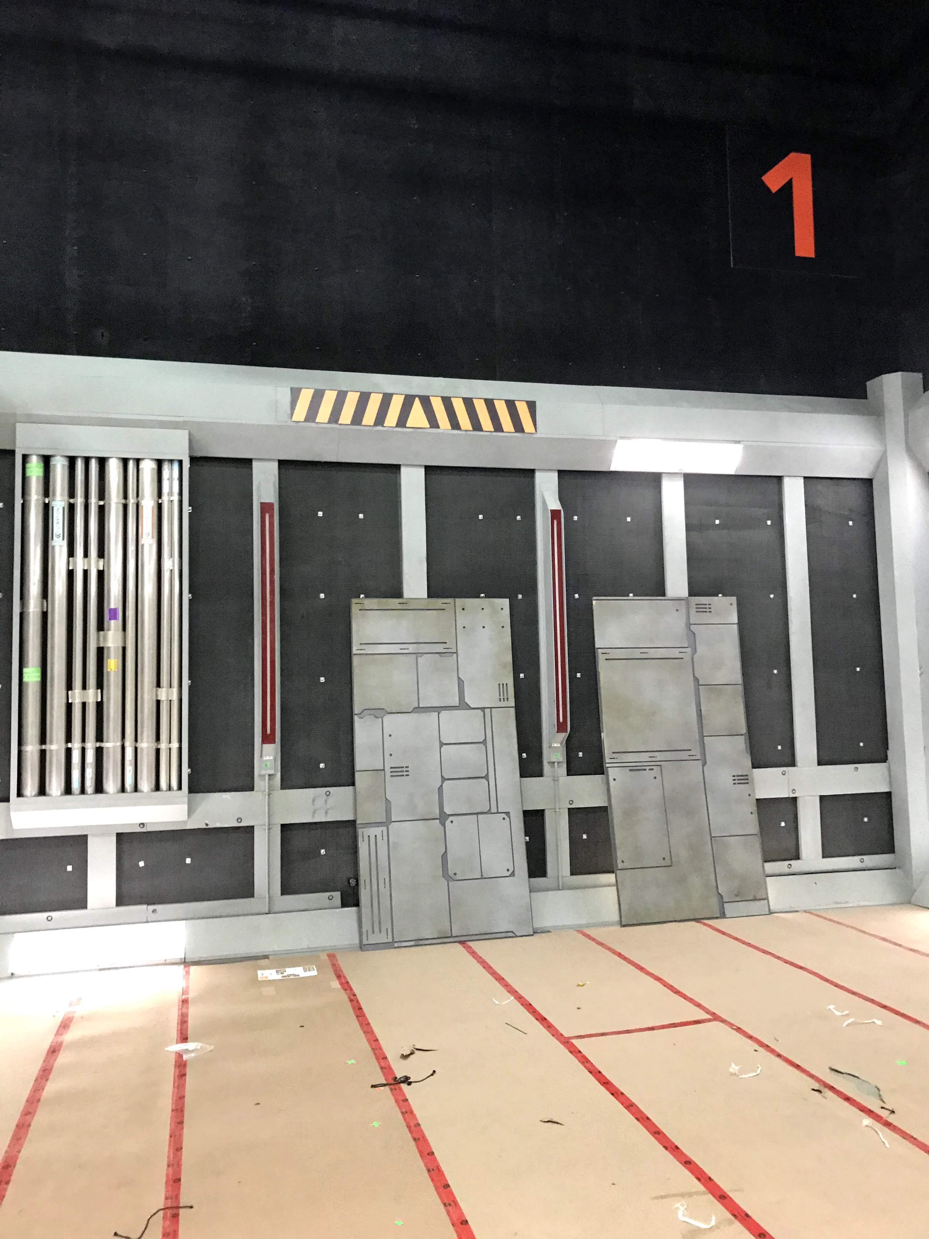
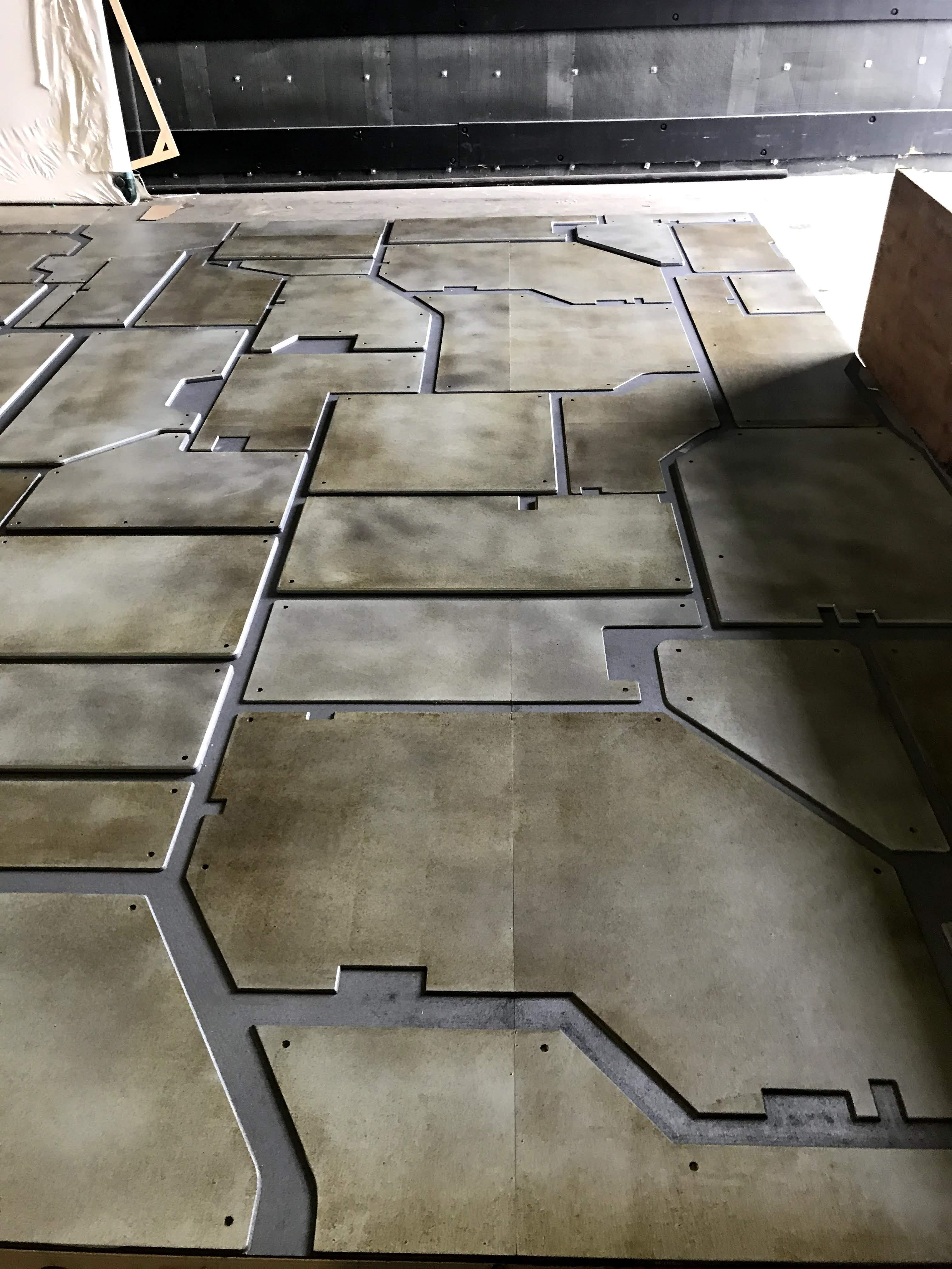
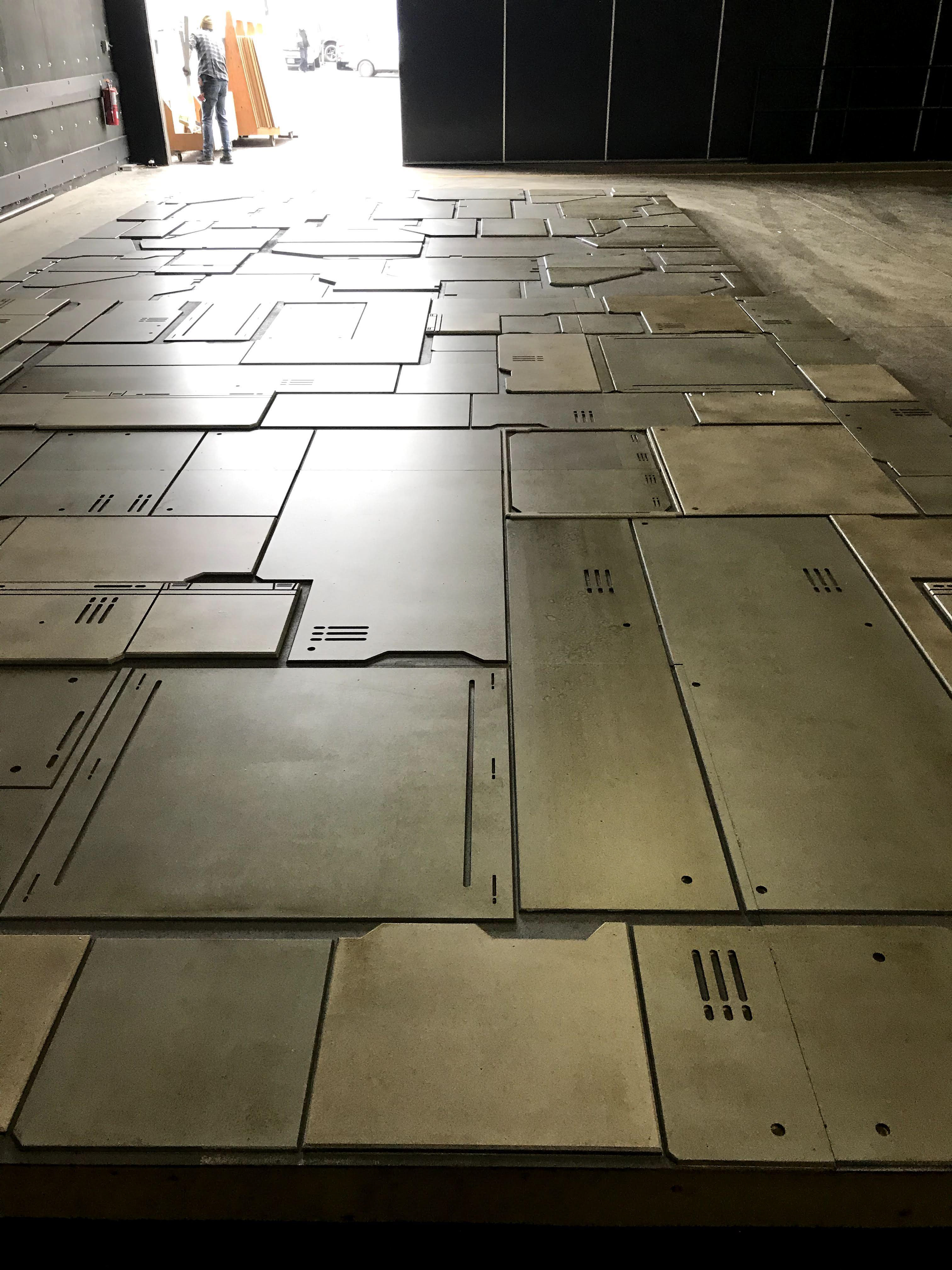
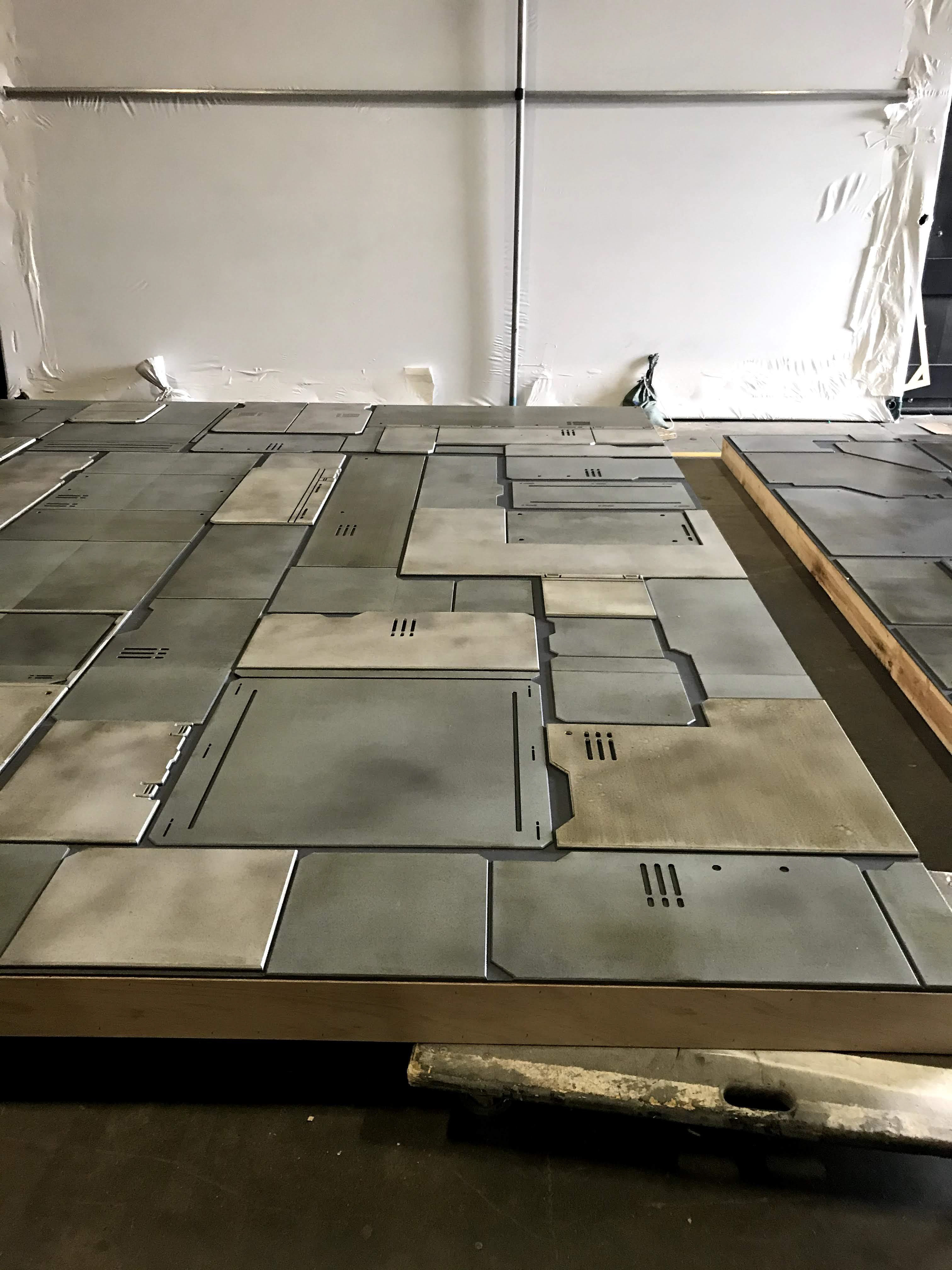
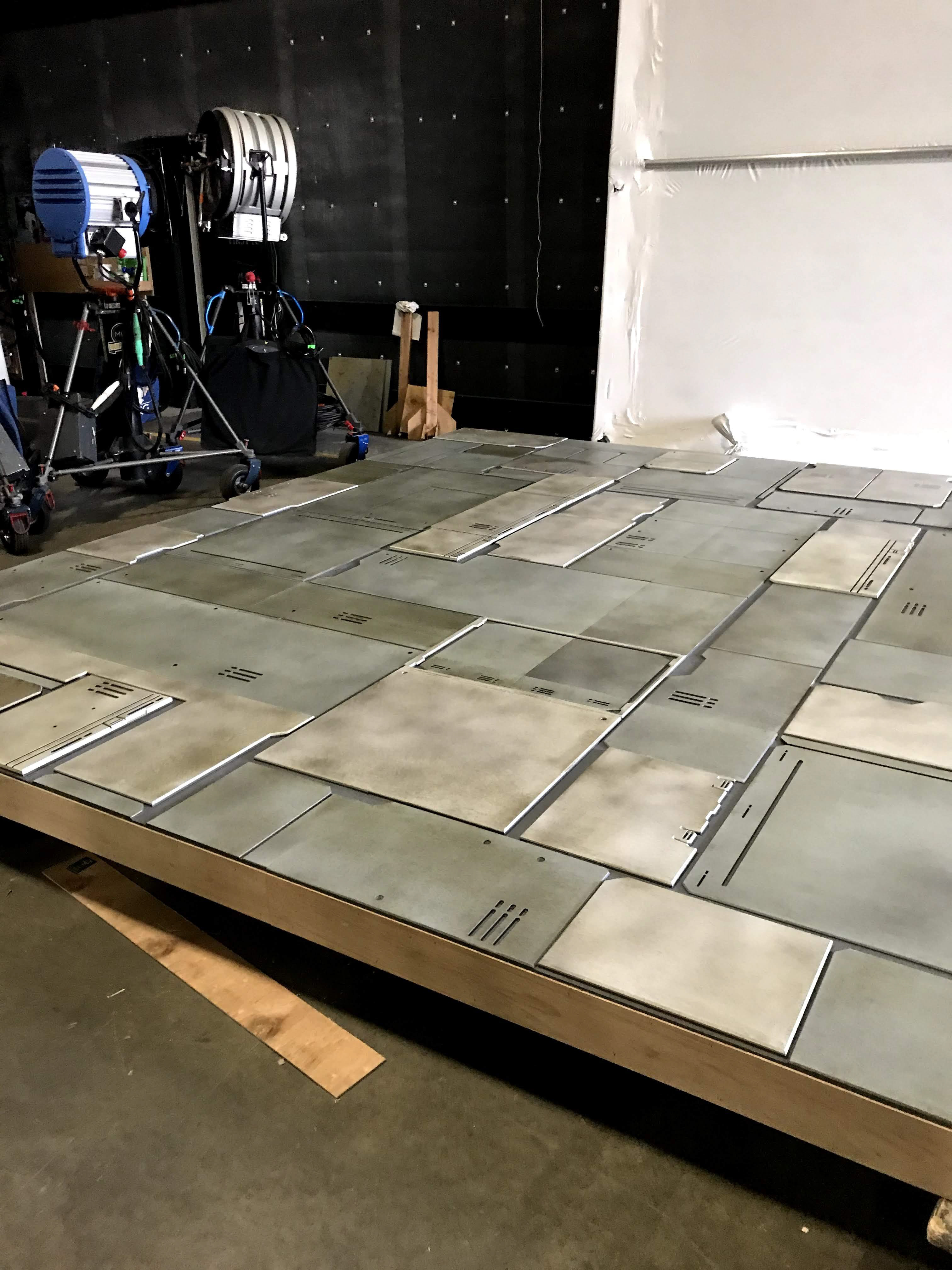
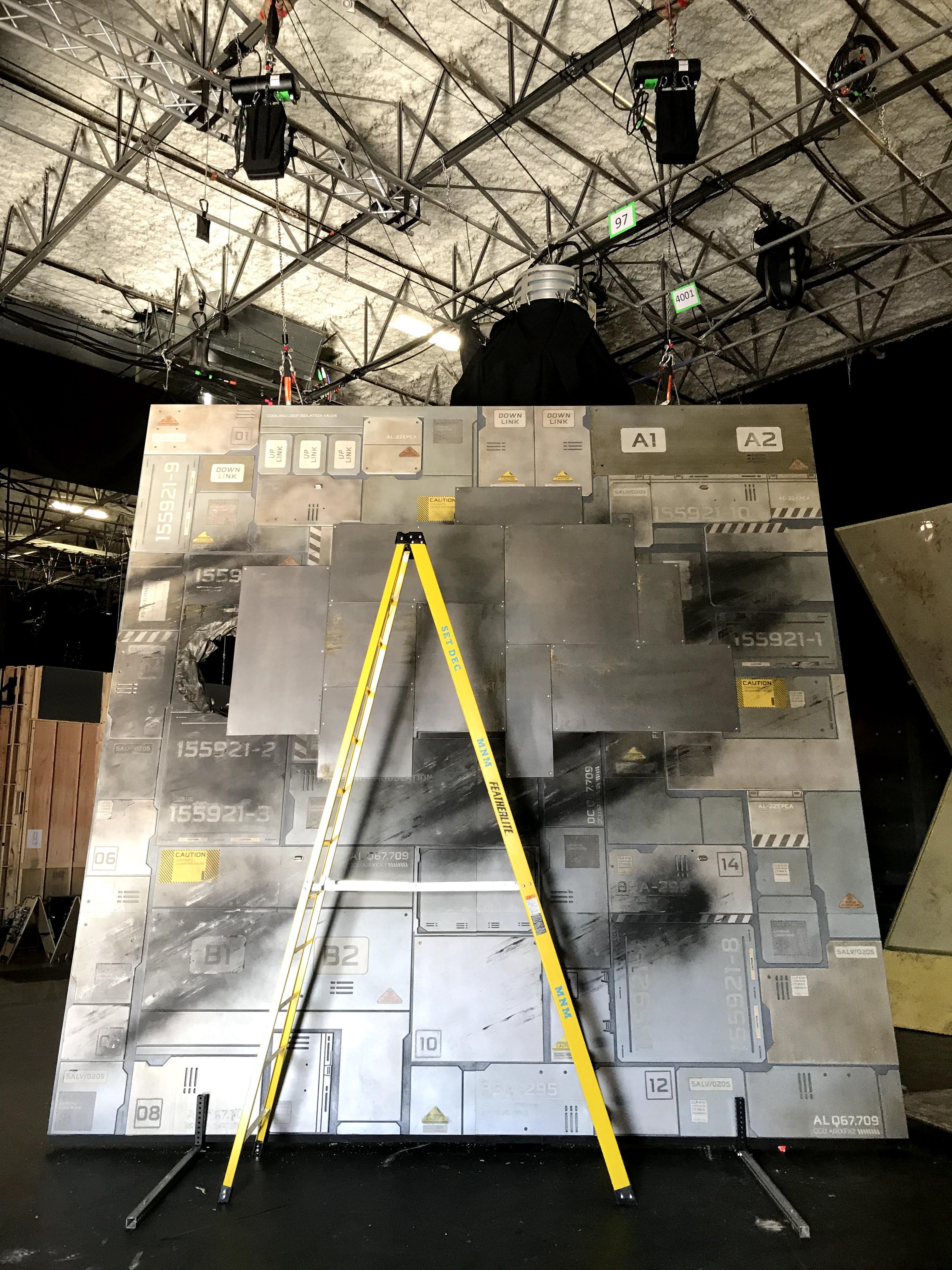
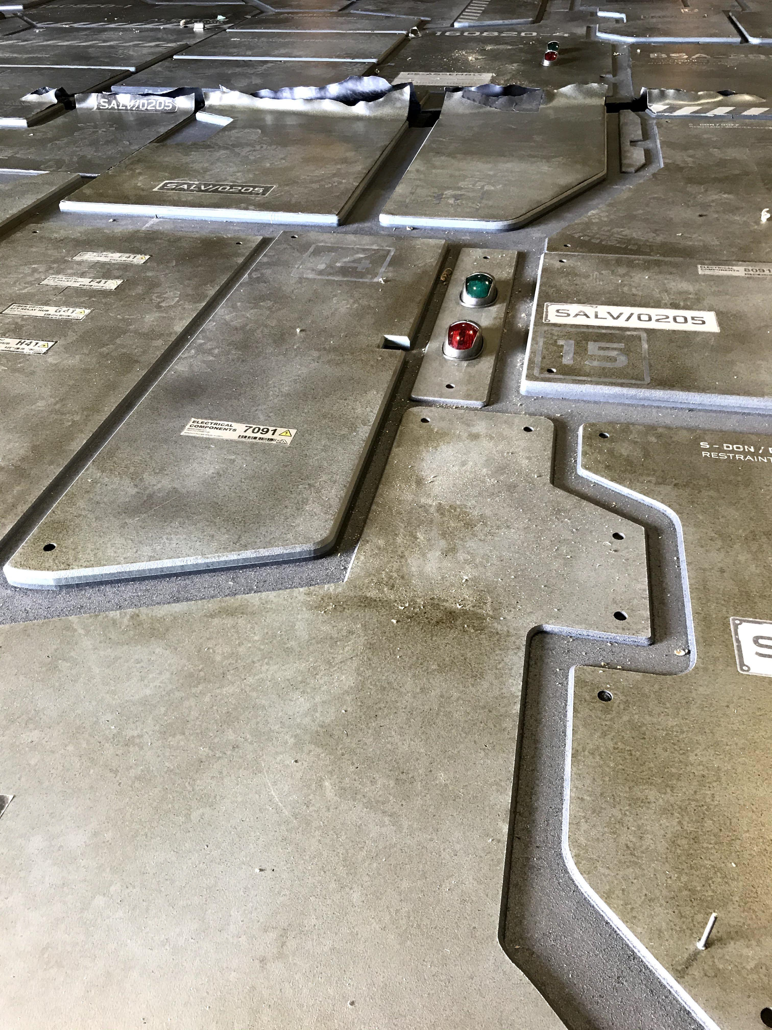
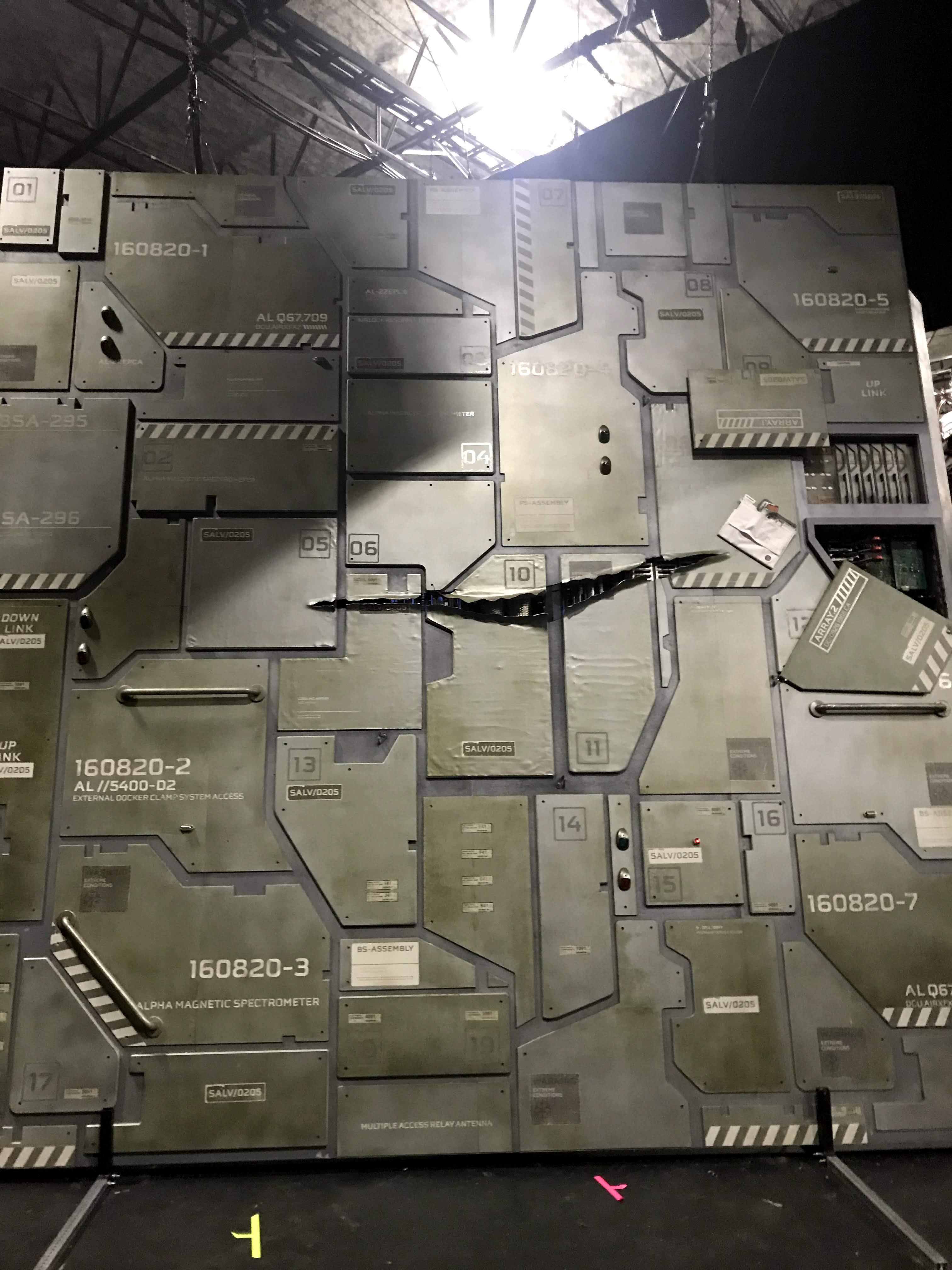
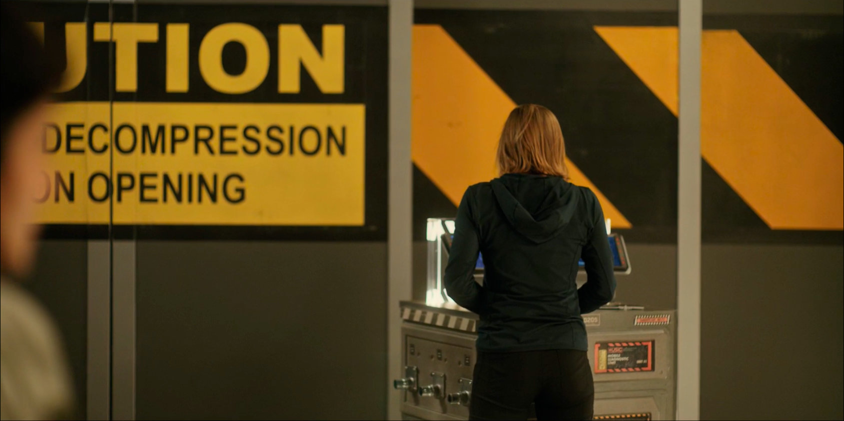
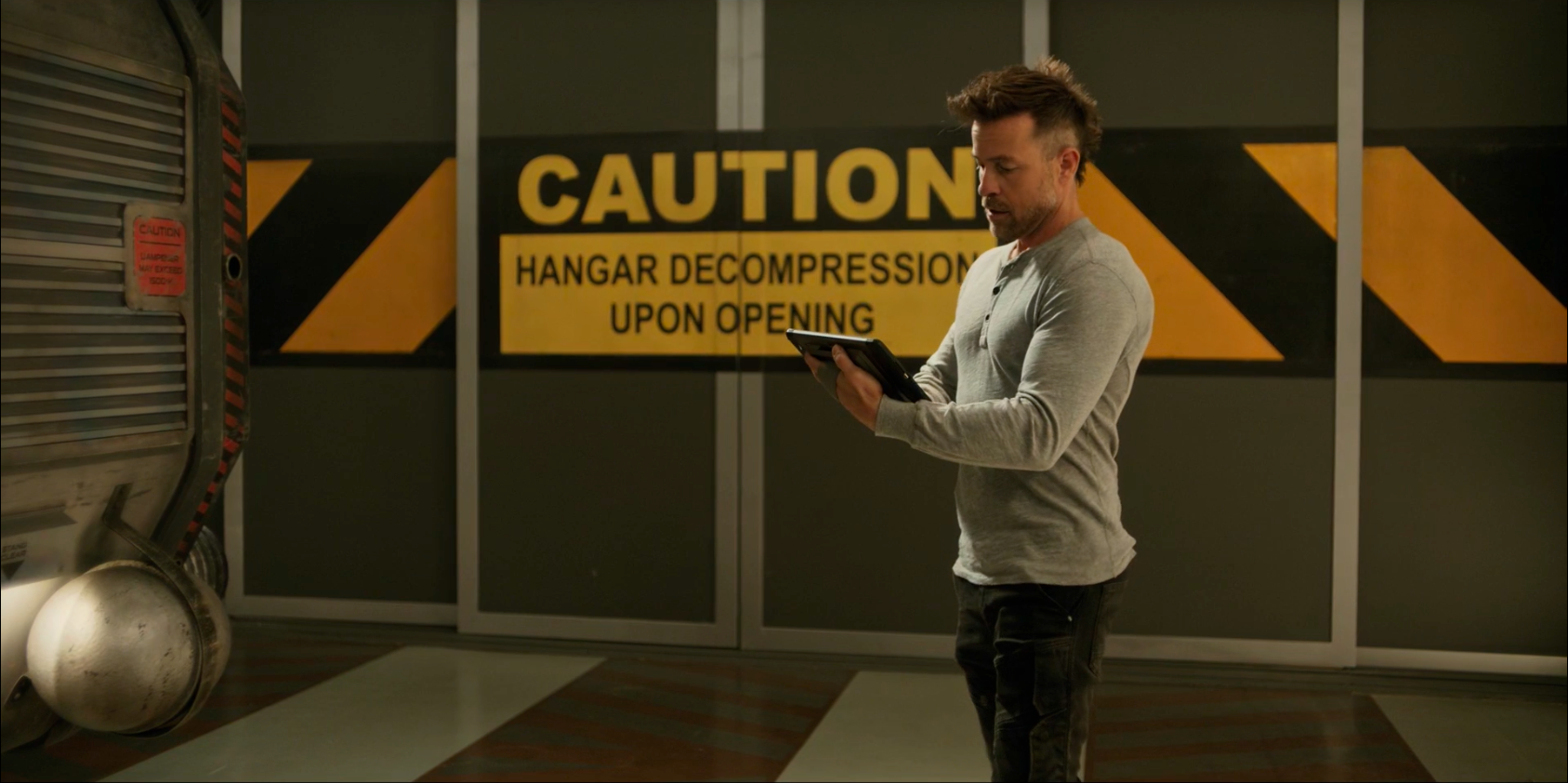
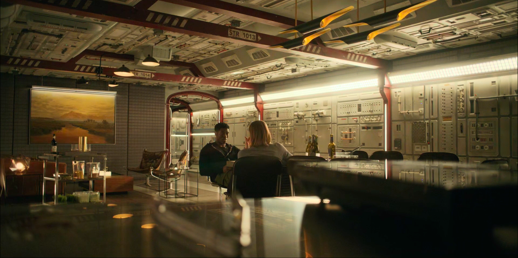
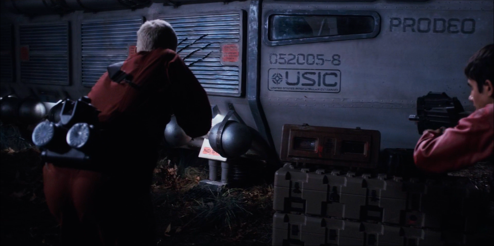
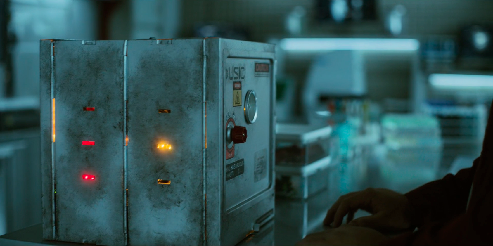
As you can see in the following photos, there was a lot of real estate that required visual coverage. My job was to create coverage that sold the idea of what you would possibly see on and in a spaceship. This included signage, wayfinding, and environmental design elements.